
Improving usability of the Cooper Union Library website
We collaborated with the Cooper Union team in a 3 month project to conduct mixed method research to analyze the PrimoVE frontend catalog search interfaces issues and devise data-driven solutions for the same.

4 weeks
Institutional
3 UX Researchers and designers, 2 Data Analysts, Cooper union and NYU engineering team
Tableau, SurveyMonkey, Figjam, Figma
My Role
Research Plan, Participant Recruitment process, Research insights, Data Analysis, Client communication, User interview, Survey design and analysis, Designing recommendations, Hi-fidelity mockups, prototyping.
Impact created
Increased the System Usability Scale (SUS) score by 60% after implementing design changes based on user feedback.
Achieved 85% user satisfaction with the redesigned catalog interface in follow-up surveys, signaling a positive user response.
Research Methods used
Qualitative
Task-based moderated user testing sessions with undergraduate students (the core target audience)
Contextual inquiries to observe users using aspects of the website
Quantitative
Survey analysis to understand readability of multiple iconography on the website
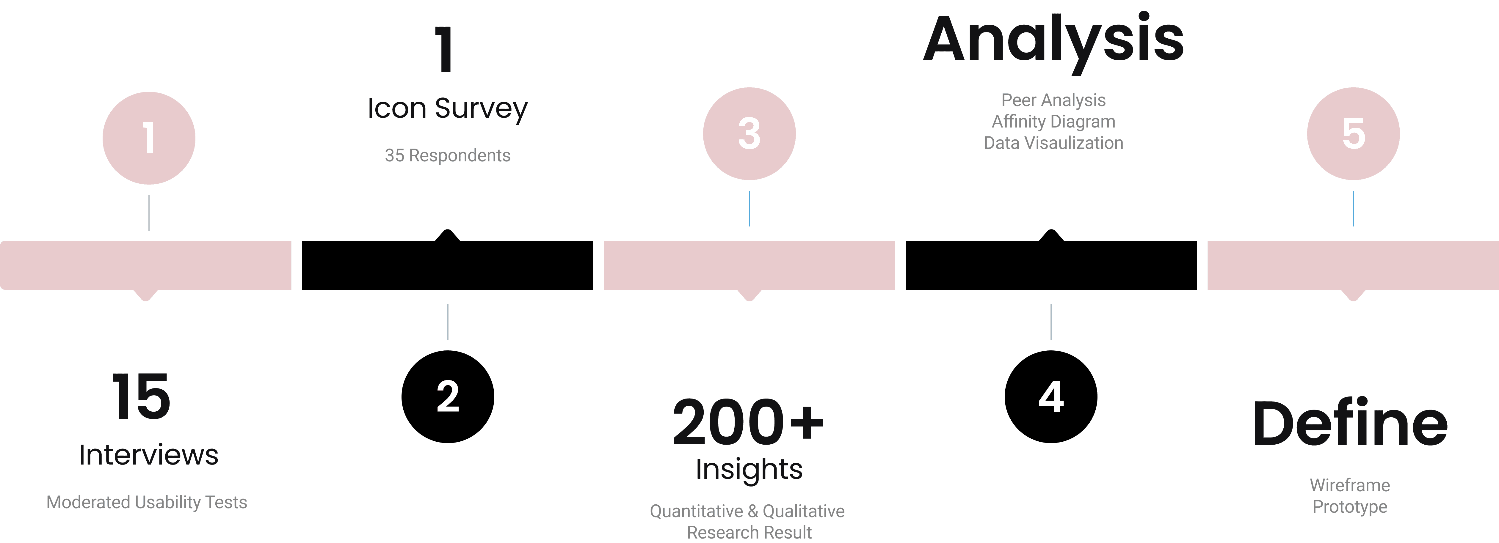
15+
Moderated user testing sessions
60%
increase in SUS scores after re-design
5+
Universities covered in survey analysis
Overview: Process base
Client Brief
Our consortium recently underwent a massive frontend and backend-integrated library system (ILS) migration. We would like to have the new catalog search interface's front end (a PrimoVE implementation) tested for our stakeholder population. This would include default search parameters, a new central discovery index (CDI), the best search results facets, and any other features available or implemented that the DX Center may wish to study. Additionally, we’d like some analysis of the graphical layout and implementation of our visual identity.
To understand the PrimoVE CDI system constraints to inform practical design, we understood the CDI aspects the engineering team can develop / edit. We focused on those aspects in our usability studies through the engineers working on the back-end system.
Client meetings with the library Director, Engineering and Librarian lead teams helped us narrow down the brief to the core issue and set a research goal:
Research Goal:
Explore students' understanding and expectation of the search- navigation flow on the Home Landing page and the Search Results page of the Cooper Union Library website.
Qualitative Research:
What we were attempting to investigate:-
• Where in a user's normal everyday flows do they face issues, and why?
• How do users respond to multiple focused points on the website?
• To understand features users use frequently, and where are the missing gaps that could make flows easier?
We decided to move forward with Moderated user research method to gain observational insights into user behavior and response when using the library webpage.
We wrote the Interview Script focused on goal-based tasks to generate detailed insights on aspects we were looking at.
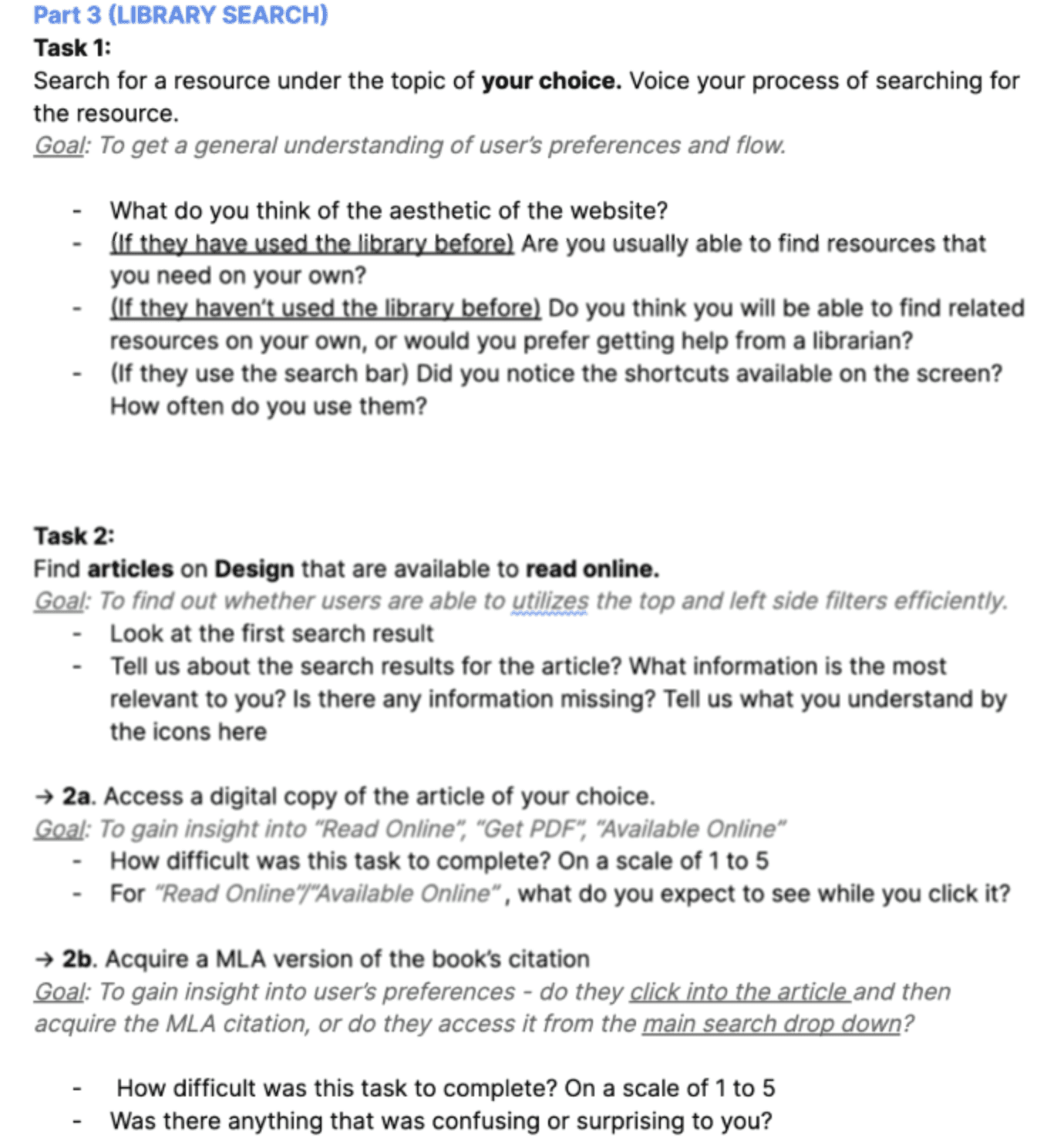
I conducted 15 moderated user testing sessions with Cooper Union students studying various disciplines, and librarians working at the Library to understand layers of issues. Designed tasks gave us a lot of feedback on specific user flows.

Qualitative Research Data Analysis

Zooming in to each task, we could understand common patterns of behavioral styles when students used the website, what aspects and exact terminologies that were confusing to understand, features that were less discoverable, and most importantly affordances that the students had no idea existed on the website.
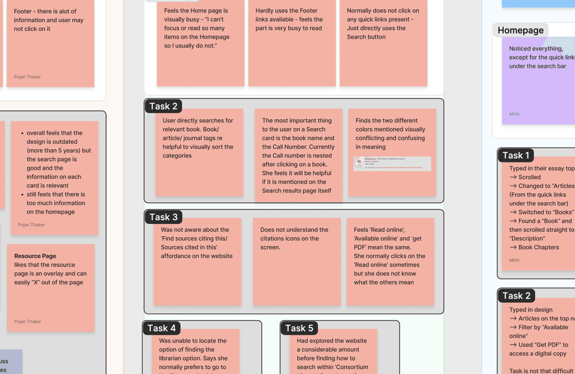
Finding recurring patterns of usability issues, we categorized them under main components tags. They were based on the search functionality, filters design on the inventory pages, iconography legibility and product feature discoverability.
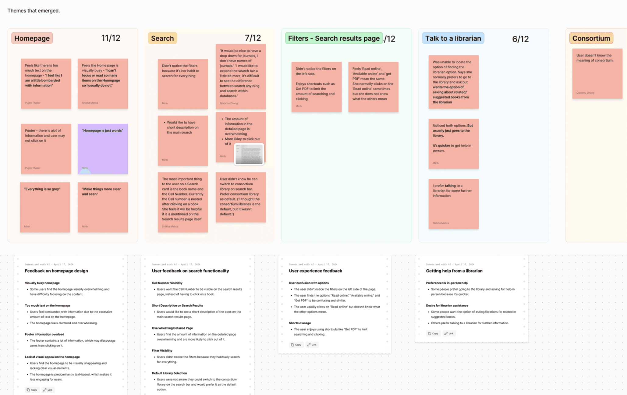
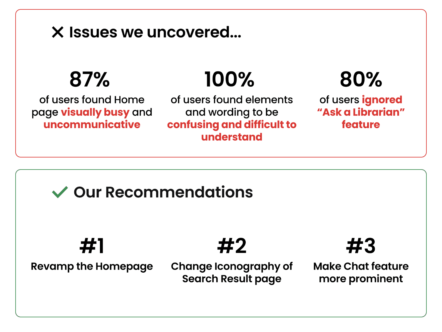
Quantitative Research revealed inconsistencies between user expectancy and actual affordance of the icons.
With the range of iconography comprehension issues, we decided to gain precise insights through quantitative data.
All the icons on the search results page had contradictory meanings according to our research and we built on the same to desing a survey that asked users to pick between the different meanings as per the interview insights provided to us.

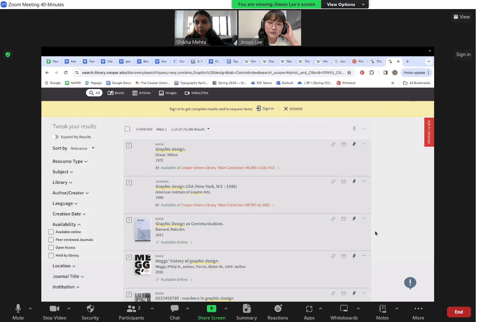
Users expect the red icons to be for sharing and downloading when they are actually Citation resources.
(Articles this resource is cited in, and articles cited in this resource respectfully)
The 'pin' icon always in a seemingly active state was seen as Saved or Pinned on top but it actually means 'Add to Favorites' in an inactive state.

Available Online. Read Online. Get PDF. "Don't they all mean the same?"
Some terminologies were found to be confusing within the website. The current functionality of these text links mean differently than the user expectancy.
Through mixed methods research we could summarize issues and design solutions.
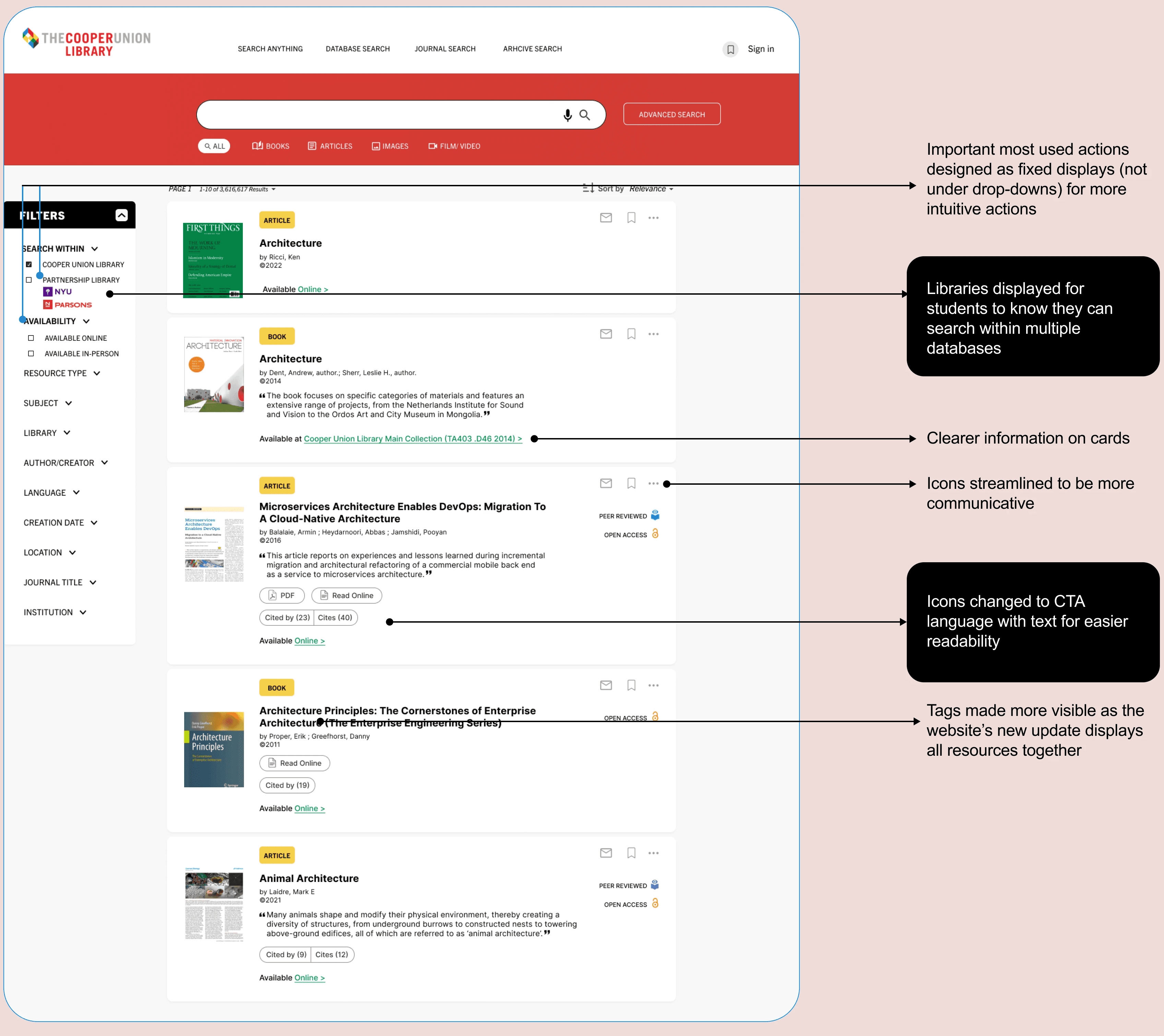
Solutions
Detailing out usability research insights on the live pages helped us re-design them solving particular issues.
91% users did not understand the meaning of Citation resources.

Recommendation: Change in iconography communication, alter filter architecture for more intuitive common actions.
87% of users found the Home page visually busy and uncommunicative.
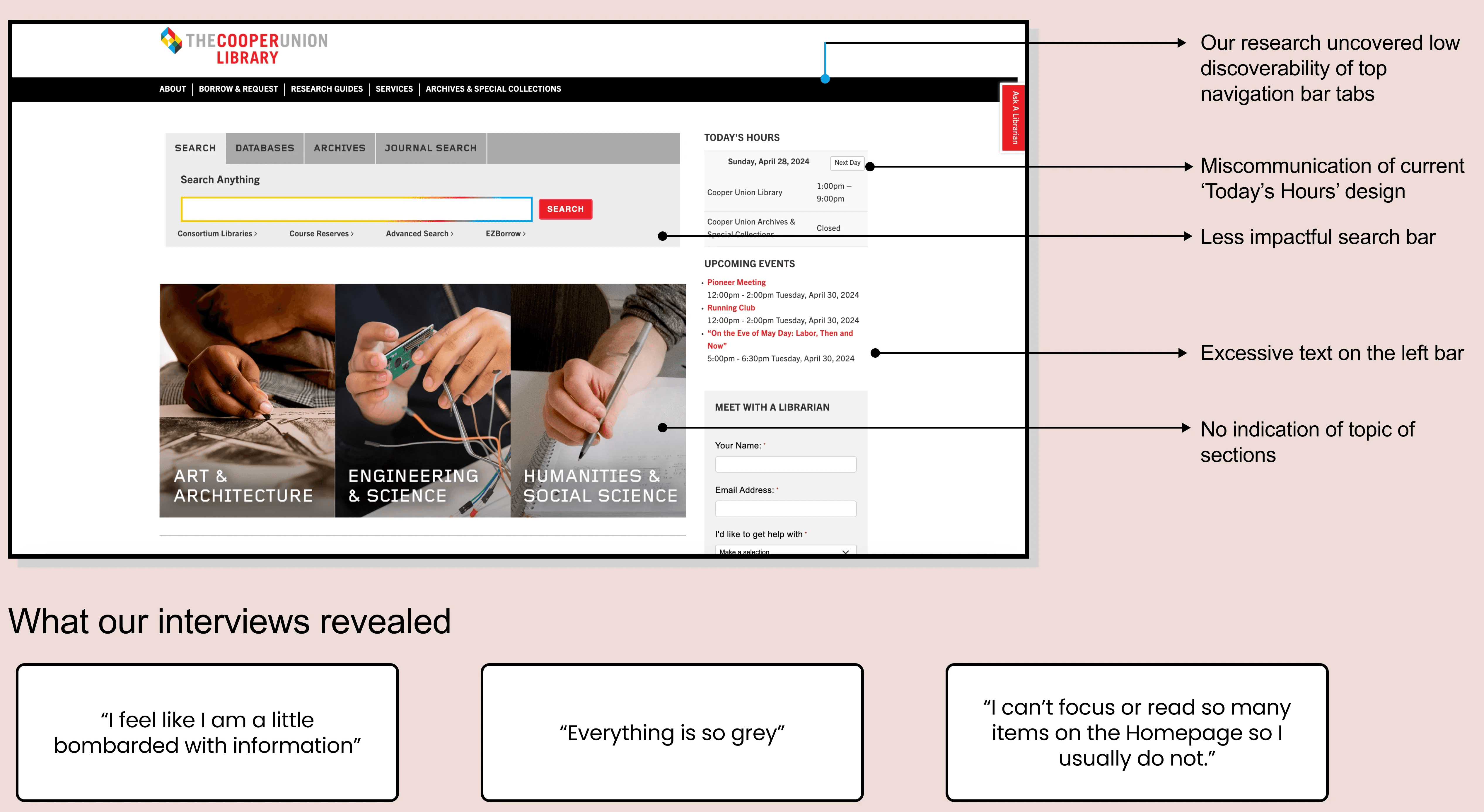
Recommendation: Change in iconography communication, alter filter architecture for more intuitive common actions.

The clients have taken all our insights into consideration and have already started some integration on their home page.
How I can develop this further
Achievements
My key take-aways
Prioritizing icon clarity for better user experiences
This project deepened my appreciation for how critical icon clarity is to user experience by observing the disconnect between what users expected and the actual icon functions.
The power of a mixed-method approach for different focus areas
This project underscored for me the value of combining qualitative and quantitative research. Observing users firsthand through moderated sessions gave me insights into their real-time behaviors and pain points, while survey data helped validate these findings on a larger scale.
Simplicity in language and visuals is key
User struggles with complex terms showed the importance of clear, intuitive language. This experience deepened my focus on creating straightforward, accessible interfaces.

