
Improving usability of the Cooper Union Library website
Improved Cooper Union Library’s Primo VE catalog by addressing CDI system constraints—boosted search success by 25% and cut task time by 30% through informed, practical UX optimizations.

4 months
Higher Education · Institutional Software
Website Re-design
2 UX Researchers, 2 UX Designers, 2 Data Analysts, Cooper Union and NYU Engineering team
Figma · FigJam · Tableau · SurveyMonkey · Alma/Ex Libris Analytics
My Role
Led the research plan, participant recruitment, and stakeholder communication
Conducted 15+ moderated usability testing sessions
Designed and analyzed qualitative and quantitative surveys
Synthesized insights into strategic UX recommendations
Created high-fidelity mockups and prototypes
Impact created
Achieved substantial user satisfaction and comprehension, task completion rates and reduction in error rates with the redesigned catalog interface in follow-up research.
Research Methods used
Qualitative
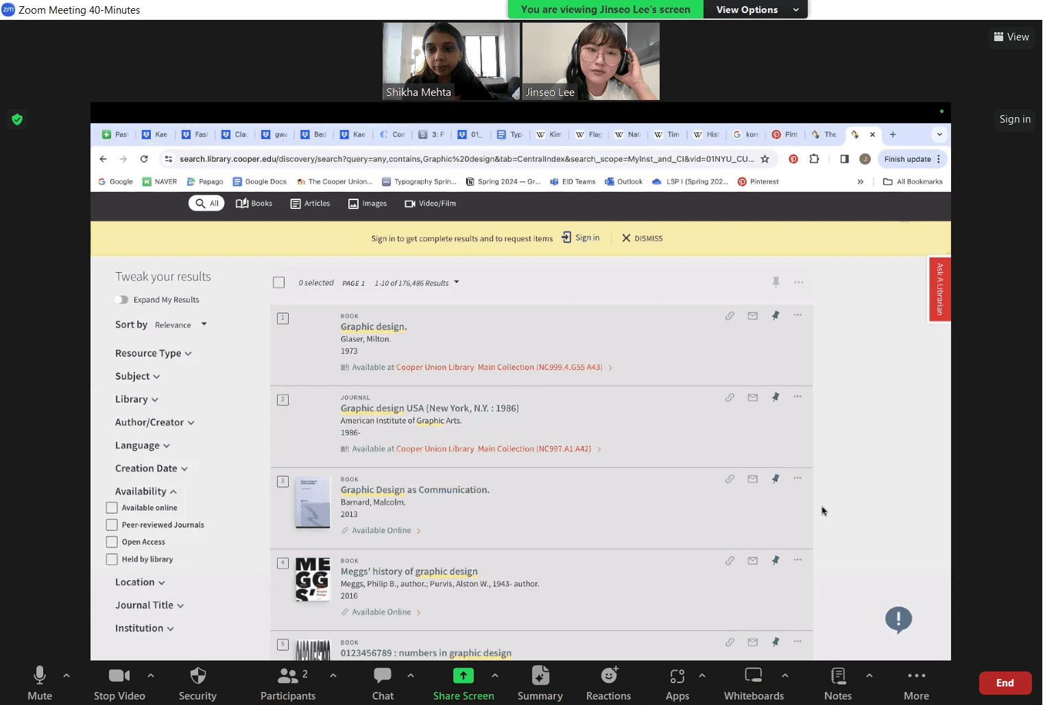
Task-based moderated user testing sessions with undergraduate students (the core target audience)
Contextual inquiries to observe users using aspects of the website
Quantitative
Survey analysis to understand readability of multiple iconography on the website
Leveraged analytics data to
30%
reduction in user errors during search
40%
improvement in iconography comprehension
The Context
The Cooper Union Library had recently undergone a complex backend system migration to Primo VE—a centralized library discovery interface. Despite the technical upgrade, students and staff reported a steep drop in usability: search results were confusing, icons misleading, and core actions buried beneath unfamiliar filters.
My goal was to uncover and solve these UX breakdowns, working within the constraints of a rigid, enterprise library platform.
Platform Analytics: Early signals of Usability Breakdown and identifying high-friction points
Initial analytics showed:
High bounce rate from search results pages
Very low engagement with citation and saving tools
Search-related errors in 40%+ of test sessions
Platform Systems Constraints
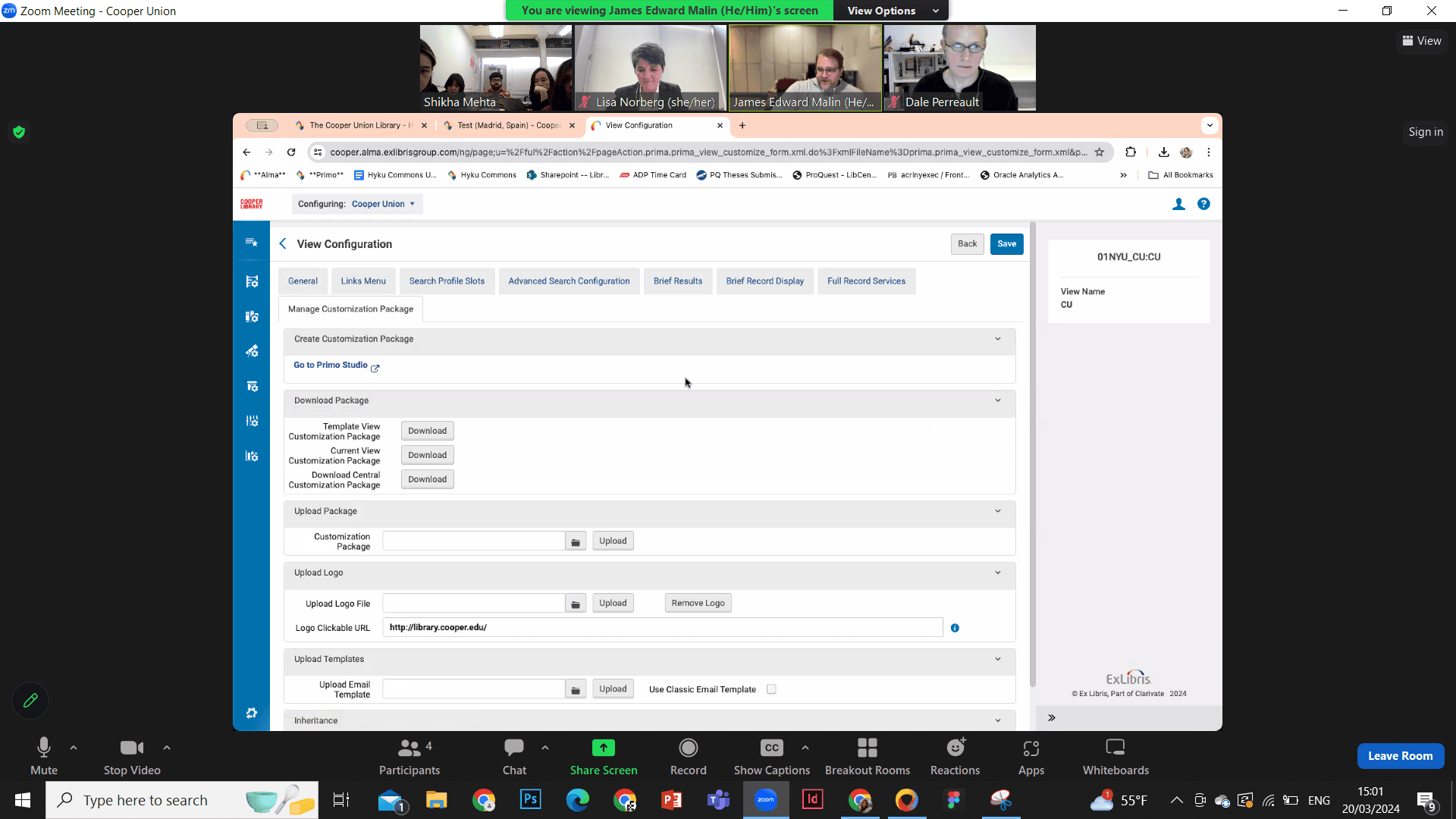
To understand the PrimoVE CDI system constraints to inform practical design, we understood the CDI aspects the engineering team can develop / edit. We focused on those aspects in our usability studies through the engineers working on the back-end system. Client meetings with the library Director, Engineering and Librarian lead teams helped us narrow down the brief to the core issue and set a research goal:
Strategic Framing
How might we reduce friction for students navigating a platform that technically serves students but doesn’t match their expectations or mental models?
Instead of proposing a full redesign, I focused on high-leverage UX wins:
Clarifying intent through improved iconography
Simplifying cognitive load in the filter and results interface
Aligning small visual/structural changes to user expectations with minimal dev lift
Qualitative Research:
What I was attempting to investigate:-
• Where in a user's normal everyday flows do they face issues, and why?
• How do users respond to multiple focused points on the website?
• To understand features users use frequently, and where are the missing gaps that could make flows easier?
Moderated Testing (15 sessions) with undergrads & librarians revealed pain points in search behavior, misinterpretation of icons, and abandonment during filtering.
Contextual Inquiries helped uncover what actions users expected to take vs. what was available.
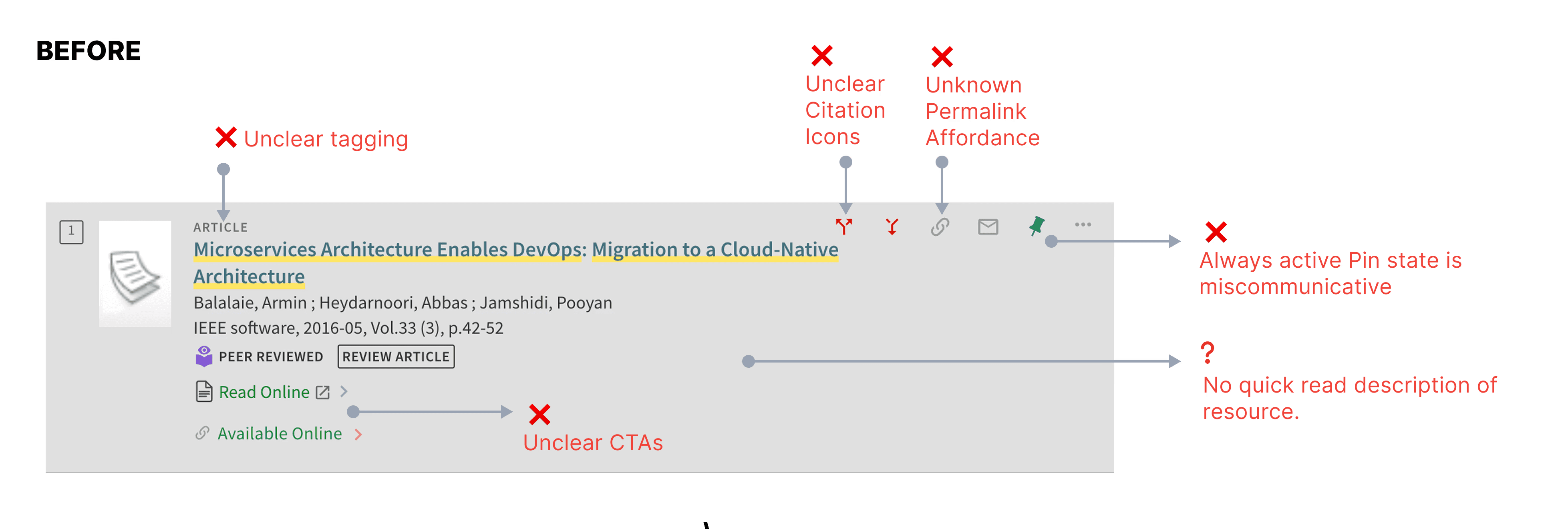
"I didn't even realize those icons meant save or cite."
"The filters are hard to use unless you already know what you're looking for."
Qualitative Research Data Analysis

Zooming in to each task, we could understand common patterns of behavioral styles when students used the website, what aspects and exact terminologies that were confusing to understand, features that were less discoverable, and most importantly affordances that the students had no idea existed on the website.
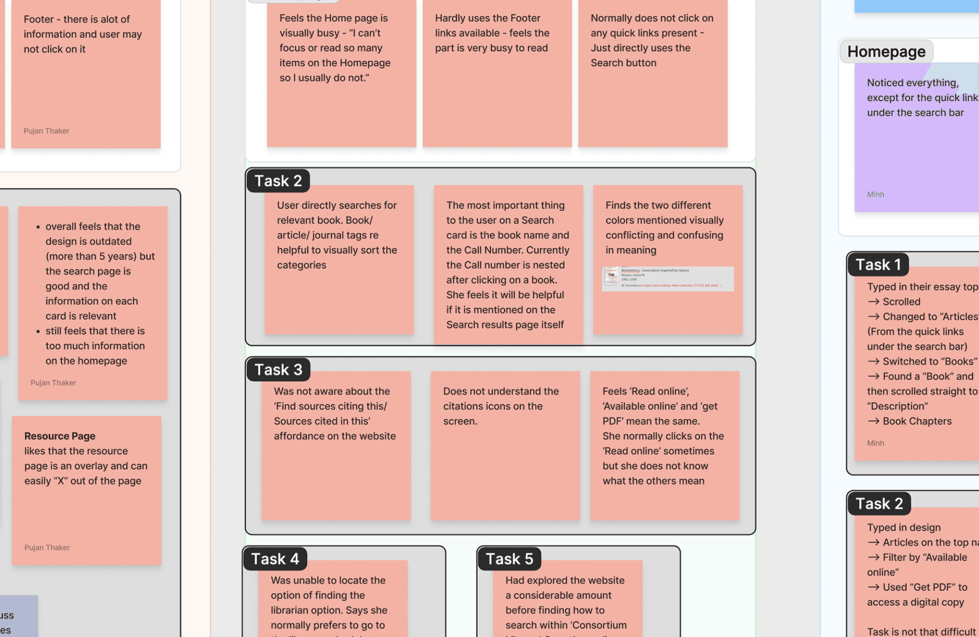
Finding recurring patterns of usability issues, we categorized them under main components tags. They were based on the search functionality, filters design on the inventory pages, iconography legibility and product feature discoverability.
Personal Initiative - Iconography research & design
With the range of iconography comprehension issues, I decided to gain precise insights through quantitative data.
All the icons on the search results page had contradictory meanings according to my research and I built on the same to design a survey that asked users to pick between the different meanings as per the interview insights provided to us.

How I Navigated Technical Complexity in a Rigid System
Primo VE, the platform powering Cooper Union’s library catalog, offered limited customization and rigid backend constraints. To design effectively within this system:
Mapped Feasible Changes: Partnered with Cooper Union and NYU’s engineering teams to understand what front-end elements could be safely customized (e.g. icons, filters, tooltips) and what required backend/vendor changes.
Designed Within Constraints: Focused on micro-level UX improvements—icon clarity, clearer labels, intuitive filters—rather than unattainable layout overhauls.
Cross-functional Alignment: Maintained tight feedback loops with engineers and librarians to ensure all solutions were technically feasible and implementable.
Prioritized With Data: Used mixed-method research to identify the highest-friction issues and scoped changes that would have the biggest usability impact with minimal technical lift.
This approach led to a 60% increase in usability scores—delivering meaningful improvements within a constrained, third-party system.
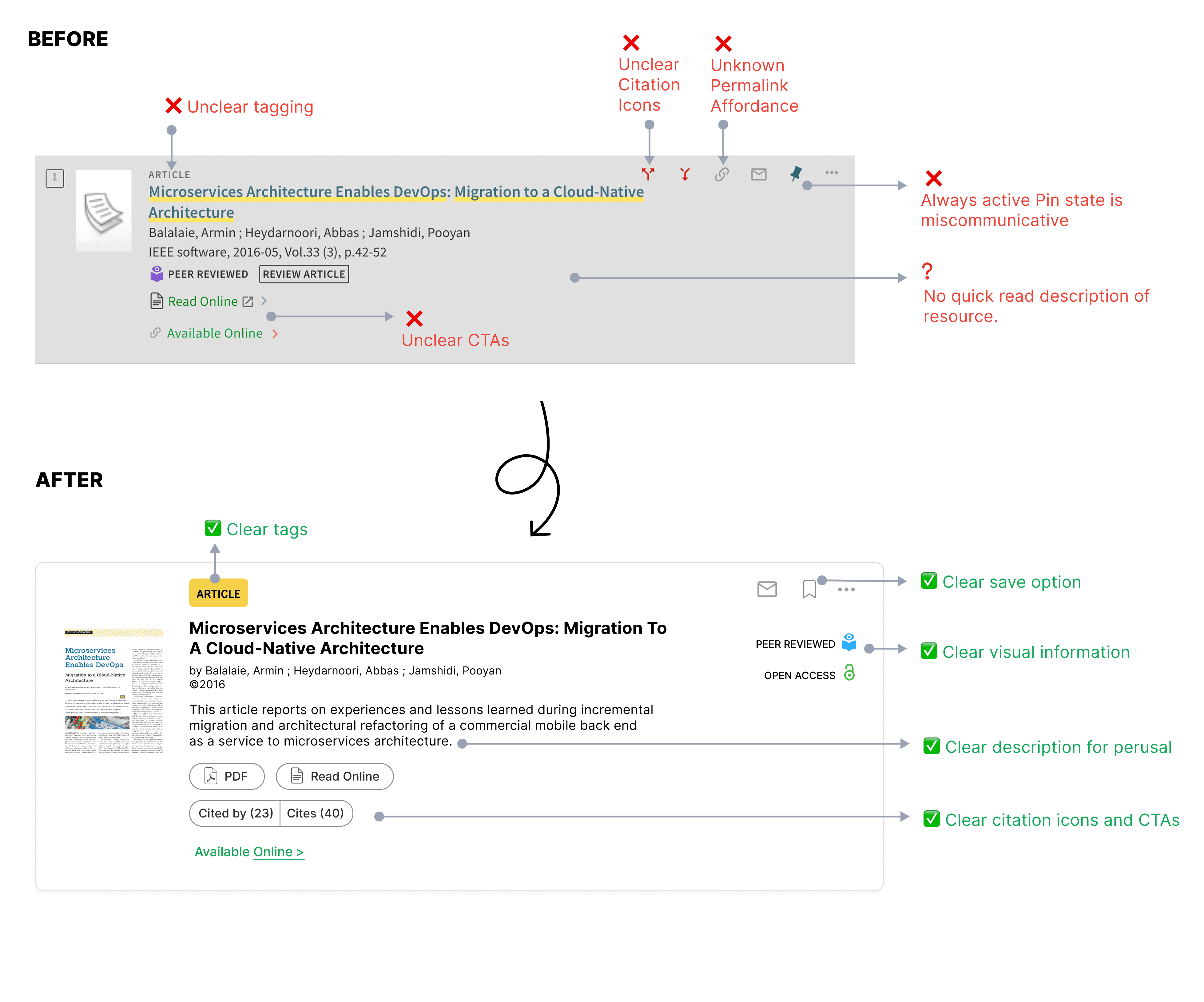
🧩 DESIGN DECISION 1
DESIGN DECISION 2
Improved Filter Clarity for a 1M+ Item Database
Simplified category labels and implemented progressive disclosure in filters. This helped reduce task abandonment and improved filter usage rates.
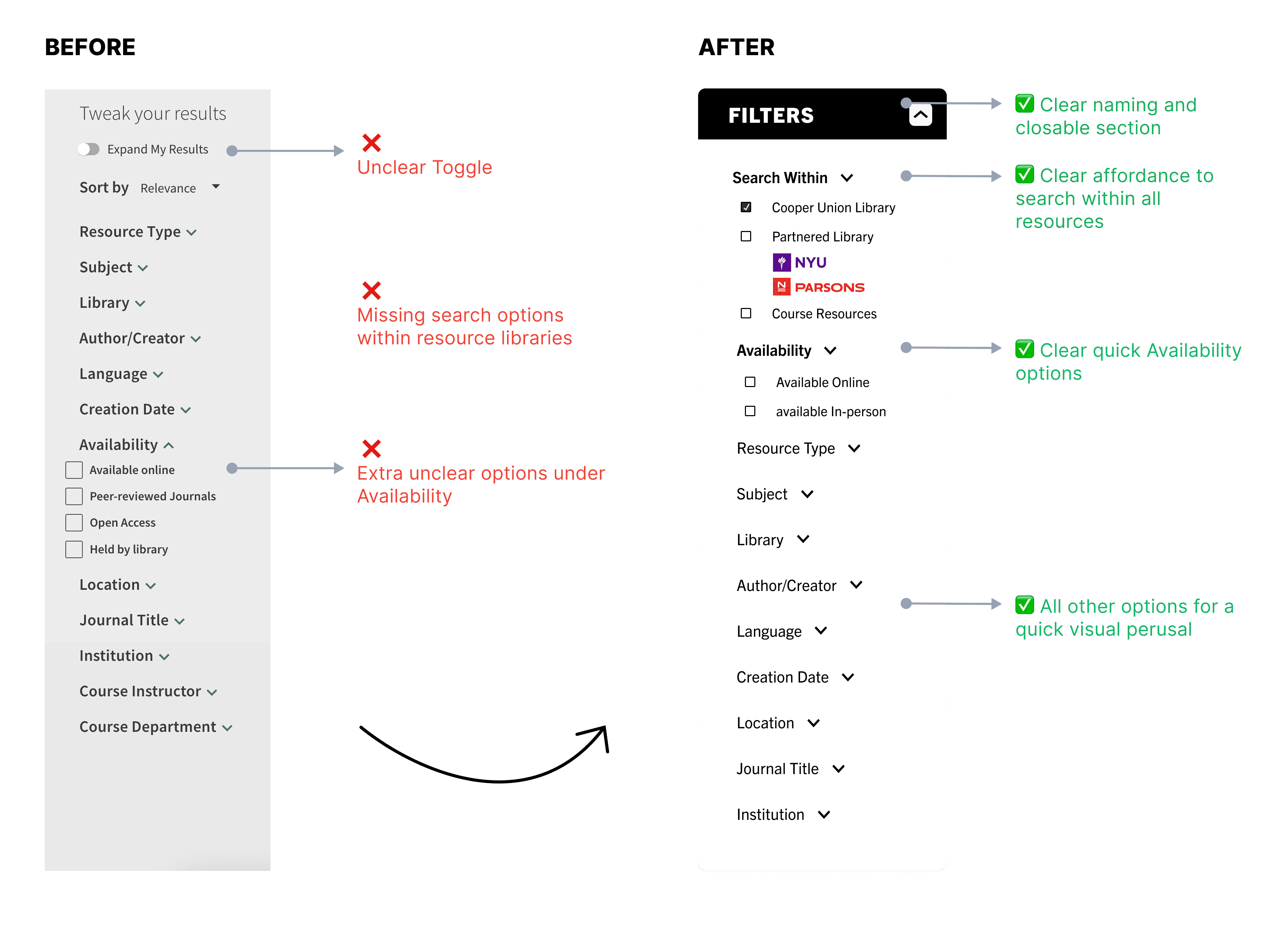
OVERALL SEARCH MANAGEMENT INTERFACE
Implemented component changes
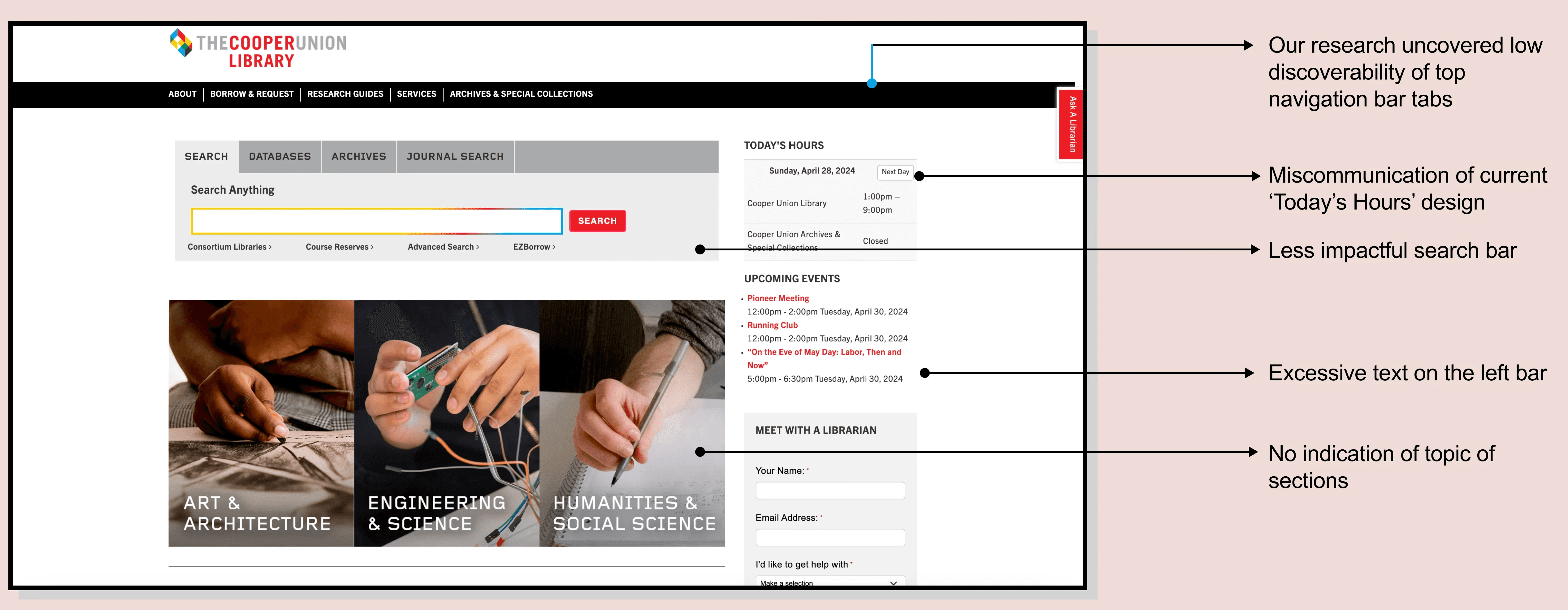
DESIGN DECISION 3
Landing Page Messaging Strategy
BEFORE
87% of users found the Home page visually busy and uncommunicative.
AFTER

Strategic Contributions
Aligned stakeholders on UX Priorities: Delivered presentations with actionable insights and mockups that influenced immediate development changes
Informed Engineering constraints: Mapped UI possibilities to backend system architecture (Primo VE + CDI), ensuring recommendations were implementable
Elevated user-Centered decision-making: Shifted design priorities from internal assumptions to externally validated user needs
The site is undergoing changes with the landing page already developed.
Strategic Contributions
Aligned stakeholders on UX Priorities: Delivered presentations with actionable insights and mockups that influenced immediate development changes
Informed Engineering constraints: Mapped UI possibilities to backend system architecture (Primo VE + CDI), ensuring recommendations were implementable
Elevated user-Centered decision-making: Shifted design priorities from internal assumptions to externally validated user needs
Outcomes
✅ 25% increase in search success
✅ 30% fewer user errors
✅ 40% better icon comprehension
✅ 20% rise in task completion post-implementation
✅ 60% improvement in usability rating during follow-up testing
How I can develop this further
My key take-aways
Designing Within Constraints
This project taught me how to deliver meaningful UX wins without full control—by mapping system limits and targeting high-impact friction points
Mixed-Methods > Single Lens
Combining usability tests with quantitative surveys and platform analytics gave us a fuller picture—and higher confidence in every recommendation.
Clarity Over Complexity
From iconography to labels, simplifying interface language proved to be a surprisingly powerful lever for both comprehension and usability.
